Cartoon Bust — Chef-Owner, Riso-Print Treatment, Lyon
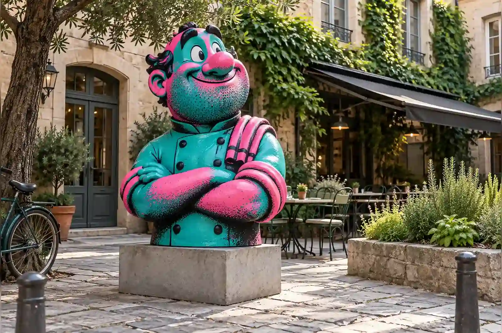
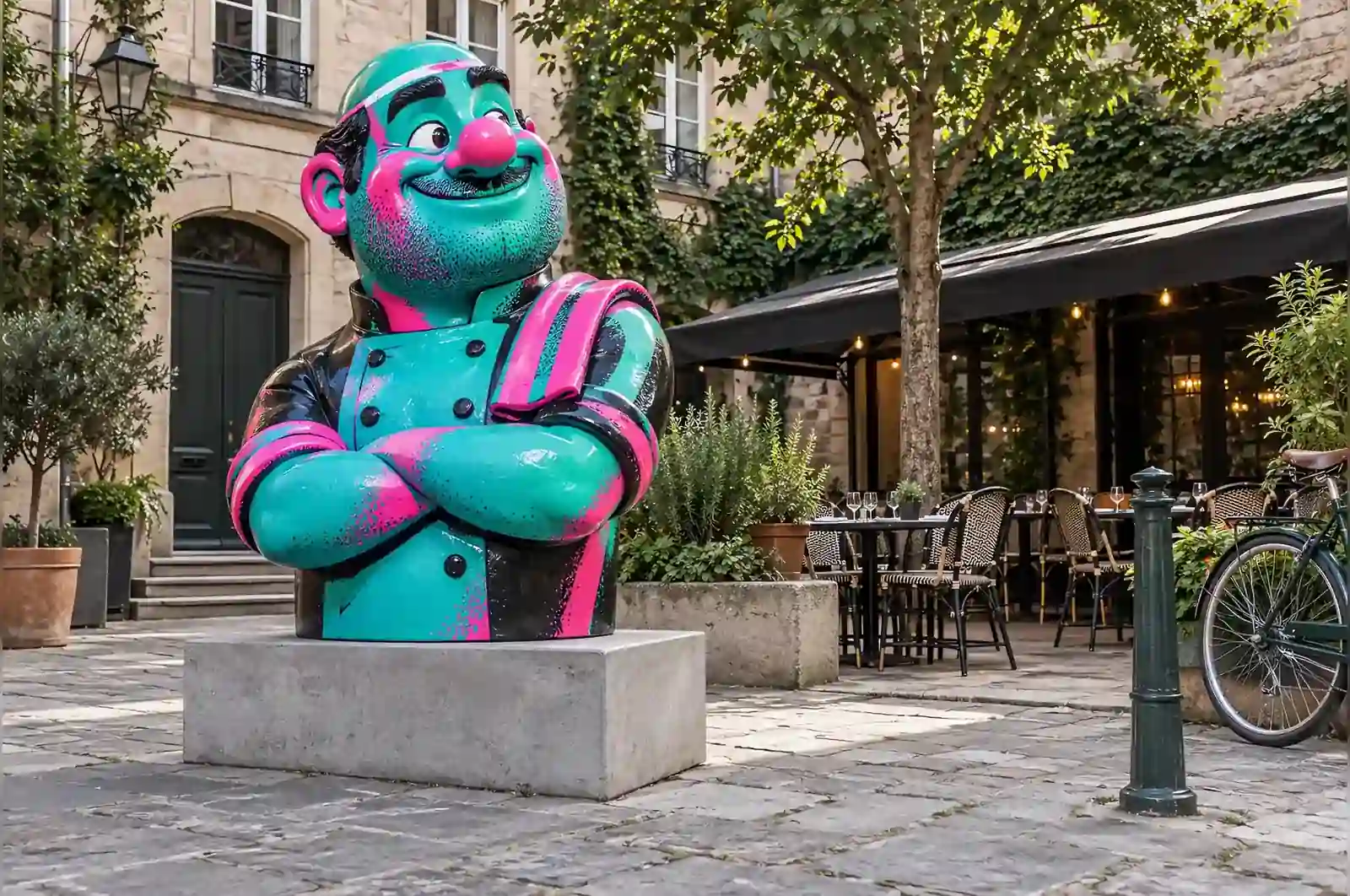

The restaurant has held a star for nineteen years and the kitchen has been run by the same two hands for all of them. The dining room wanted the bust to live in the courtyard, where the family eats in summer, and they wanted it to look like something that came off a small press.
Three inks, deliberately out of register
Risograph printing has a specific look: two or three flat inks, each printed separately, overlapping imperfectly so that a third colour appears only where two of them cross. It is cheap, fast and slightly wrong, and it has become the visual signature of a certain kind of independently published food magazine.
So the bust is teal, fluorescent pink and black. Teal is the jacket and the hair. Pink is the skin. Where the two overlap at the collar, a muddy mauve appears, and that is the only tonal transition on the piece.
Making the misregistration
The whole effect depends on the inks not lining up. We reproduced it by offsetting the pink third of the sculpture from the teal third by about 4 mm at the shoulder, 8 mm at the ear and 2 mm at the chin, so the displacement changes across the form the way a real misprint does when the paper shifts.
The grain was the other half of the job. Risograph ink sits on the paper with a fine mottle, so the finish is a low-sheen two-pack with a slightly uneven lay-down, never fully flat and never glossy.
The caricature
At 1.5 m this is the smallest piece in its category, which was the client’s choice: it has to sit beside a courtyard table without dominating it. The exaggeration is all in the head — a little too large, a little too tilted, with the trademark tea towel over one shoulder reproduced in teal.
What the brief would not give up
The size was the first thing fixed. The dining room wanted the bust beside a courtyard table without dominating it, and 1.5 m is the smallest this piece can be and still read as a figure rather than a tabletop object. Had they asked for 0.9 m, it would have moved onto a plinth or a table, and the caricature would have had to be calmer, because at that scale a tilted head reads as a defect rather than a decision. Had they asked for 2.4 m, the courtyard would have begun to feel occupied by it rather than arranged around it.
The finish was the second thing fixed. Teal, fluorescent pink and black, out of register, low sheen — the whole identification of the piece as something from a small press depends on those three choices. If the client had wanted a conventional gloss car-paint finish, the mottled lay-down would have gone, and with it the reference to the magazine.
The placement was the third. Outdoors, on the paving, in Lyon’s freeze-and-thaw winters, the clear coat carries the weather load rather than the pigment. The FRP shell is what the rain and the frost meet first, and the coat is the barrier between the two. Indoors, in a dry dining room, the same finish would have needed a simpler and less weather-tolerant coating, and the brief would have been easier on the surface rather than harder.
In the courtyard
It stands on the paving beside the herb bed, at the exact spot where the chef has stood for photographs after every service since 2007. The kitchen staff polish it with the same cloth they use on the pass. It already has a slightly polished cheek, and nobody intends to stop that.
The clear coat and the cloth
The shell is FRP, hand-laminated over an internal steel frame and gloss-painted before the riso treatment goes on. At 1.5 m tall, 0.6 m wide and 0.4 m deep the whole piece is a two-person lift: the steel frame carries the weight, and the FRP carries the finish.
The finish is the part that needs care. Because the pink third is offset from the teal third, the surface is deliberately uneven, and a uniform buff across the whole form would wear the mottle down to a single flat tone. The kitchen staff polish it with a soft, dry cloth and no abrasive. That is the right instinct: the low-sheen UV clear coat is what protects the pigment outdoors, and an abrasive would cut through it in a season.
In Lyon the coat has to survive rain and freeze-and-thaw. If it dulls after a few years it can be re-coated in place by hand with the same two-pack, without taking the piece apart. That is the one maintenance job a brief for this finish should budget for.
What this means for your own brief
Three questions settle most of a brief like this before a quote is asked.
First, where is it going to live, and is that indoors or out? It decides the clear coat. This piece stands on paving in a courtyard, so the coat is weather-rated and UV-stabilised; the same finish in a dry foyer would not need the same coating.
Second, how large relative to what surrounds it? This client chose 1.5 m because the bust had to sit beside a courtyard table without dominating it. The same commission at 2.4 m would have changed the brief from a companion to a landmark.
Third, how closely will people get to it, and will they touch it? This one is polished with the pass cloth after service, so the finish had to tolerate regular handling. A piece behind a barrier could carry a more delicate lay-down.
One more thing to settle early: a finish that imitates print has the offsets set into the lay-up, not added afterwards. Decide the registration — where the pink sits against the teal, and by how much — before tooling, not after.
It is slightly wrong in all the right places. Anybody who has ever worked a service will understand that immediately.
A restaurant in Lyon, France