
Rascal — Memphis-Style Cartoon Beagle, Milan Design District

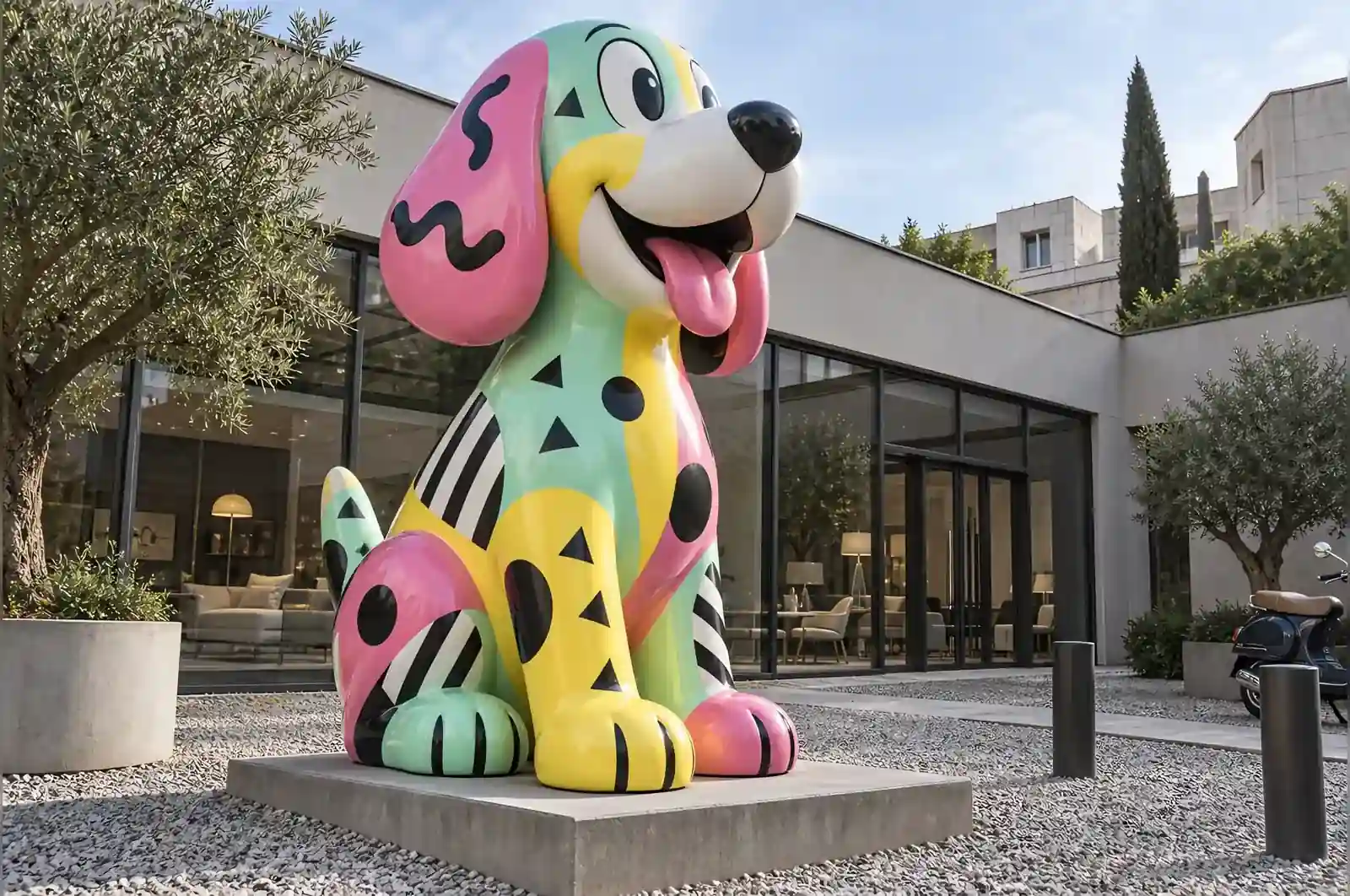
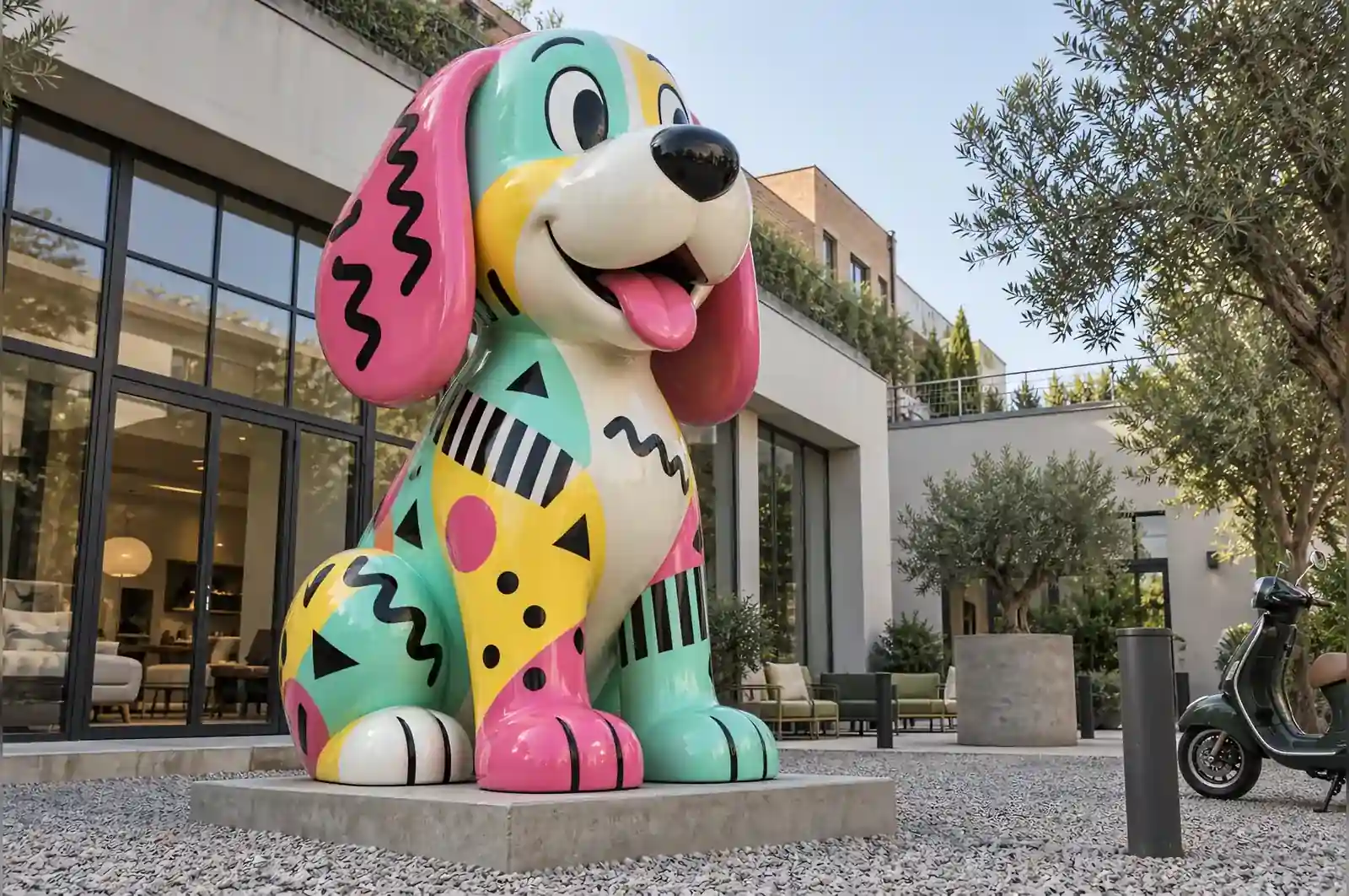
The showroom sells Italian furniture from the 1980s. They came to us with a beagle, a colour card and a very specific fear: that their dog sculpture would look like something from a garden centre.
The brief, in their words
Make it look like a piece from the decade we sell. Which meant going back to the Memphis group’s rulebook: mint, hot pink and lemon, black as a structural colour, and decoration that refuses to sit still.
Where the pattern is allowed to go
Memphis on a flat surface is easy. Memphis on a curved animal needs a rule, or the piece becomes noise. Ours was that the painted graphics describe the form rather than fight it. Squiggles run along the long axis of the back. Triangles sit where a plane changes direction. Circles land on the flat of the ears and the haunch. None of the graphics cross the eyes, because that is where the piece stops being a character.
The black is doing more work than the colours. Four black lines — the brow, the ear edge, the back, the tail — carry the whole silhouette at a distance; the pink, mint and lemon only tell you what kind of object it is.
Build
Fibreglass over a steel frame, satin rather than gloss so the courtyard gravel light does not wash the pattern out. The graphics are hand-masked and sprayed, not printed, so the edges stay slightly soft, which is how the originals looked.
What it does in the courtyard
It is the one thing in the courtyard that is not for sale, and it is the thing people photograph. The showroom has started running its opening-night parties around it, which we did not plan and are happy about.
The three things this brief fixed
Three decisions were effectively settled before the first drawing, because each one was forced by the site rather than chosen for taste. The first is the height. At 1.9 m the dog stands at roughly an adult’s eye line in the courtyard, which makes it a piece you meet rather than a thing you look down on; it also keeps it below the showroom fascia, so it never competes with the building for attention. Drop it to 1.2 m and it reads as a garden ornament. The 1.0 m width and 0.7 m depth give it the stocky stance that lets the silhouette hold up from the street, where the four black lines are doing most of the work.
The second is the finish. The courtyard is open to the sky and the gravel bounces light in every direction, so a gloss coat would have turned the whole pattern into one moving reflection that changed with the weather. Satin holds the colours in that light. The trade-off is that the satin reads slightly less vivid indoors under track lighting — if the piece had been going inside the showroom, we would have glossed it and the Memphis palette would have looked brighter and sharper.
The third is the placement. It stands freestanding in the middle of the courtyard, which is why the graphics had to be carried around all four sides. If it had been set against a wall, the back would have been plain and the decoration concentrated on the two faces people actually see.
Maintaining a hand-painted satin finish in an open courtyard
At 1.9 m on a gravel courtyard, the piece is a low object with a large painted surface close to the ground, so most of the maintenance is about grit, not weather. Rain splashes fine gravel dust up to about knee height against the base. The satin coat shows that film as a dull haze more readily than a gloss would, so the practical rule is a wipe-down with a soft cloth and mild soap about once a month, and after any heavy rain. Because the surface is satin, dust reads as a uniform haze rather than as streaks, which makes it easier to notice and harder to get wrong.
The graphics are hand-masked and sprayed rather than printed, so their edges are deliberately soft. That is what makes them look like the 1980s originals, and it is also the constraint on any repair. A printed decal could be peeled and replaced whole; a sprayed graphic cannot. If a patch does lift, the panel has to be re-masked and resprayed to match, which is why the edges are the part to check first in an annual inspection.
The steel frame inside is sealed, but at this size the plinth sits low enough that splash-back keeps it damp. The satin UV clear coat is the barrier, and it is UV-stabilised, but the black lines chalk a little faster than the tinted colours because black absorbs more. An annual check of the base and the black lines is enough to keep a piece like this going for years.
Questions to settle before you commission something similar
If this brief sounds close to yours, there are four things worth deciding before you ask for a quote, because each one changes the build. First, which side is the front. The graphics are masked to describe the form, so the pattern density can be tuned toward the view that matters most; a piece that has to work from every angle is a different and larger job than one with a single main face.
Second, whether the palette has to match something you already own. The Memphis scheme here was fixed by the brief — mint, hot pink, lemon and black — and the rule that black carries the silhouette held even so. Bring a corporate palette instead and the same rule still applies, but the accent set changes and so does the balance of the piece.
Third, indoor or outdoor. It decides gloss against satin, whether the clear coat needs UV stabilisation, and how the base is sealed against splash. Fourth, how close people actually get. The showroom’s visitors stand well back and photograph it; a piece in a busy corridor will be touched, and a satin finish shows fewer fingerprints than gloss but still needs the wipe-down schedule to stay presentable.
Every visitor asks who the artist is. We tell them it is a beagle. Then they photograph it, which is the only review that matters to us.
A furniture showroom in Milan's design district