
Cartoon Cat Art Styles: A Complete Guide
2026-09-18
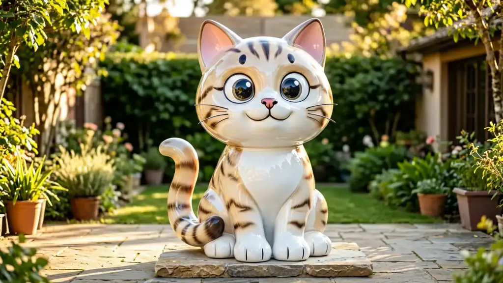
The first question in a cat commission is never size or price. It is style — because a cat is the one animal that stops being a cat the moment you get the drawing language wrong. Get a dog’s proportions slightly off and it still reads as a dog. Get a cat’s ear set or tail carriage wrong and what you have is a generic animal with whiskers.
This guide sets out the cartoon cat art styles we actually build in fibreglass, what each one does well at architectural scale, and where each one stops working. Everything below is FRP fibreglass sculpture, hand-finished, built from 1.5 m up.
Why a cat is the hardest cartoon animal to style
A cat is read through four things and nothing else: the ear set, the line of the back, the tail, and the eyes. Fur, whiskers and claw detail are the last five per cent of the likeness — they are what people notice after they have already decided the piece looks like a cat.
That is why style comes before detail on a large piece. At 2.5 m, a viewer stands far enough away that a hand-painted stripe pattern is invisible; a wrong ear set is not. Any style you choose has to carry the cat in silhouette first, and use surface treatment second.
The cartoon cat art styles we build
1. Vinyl-toy: soft corners, clean surface, no outline
The designer-toy language — a cat drawn with the simplified confidence of a pocket-sized collectible figure. Heads are slightly oversized, limbs are rounded tubes, the tail is a single confident curve, and there is no outline anywhere because the form itself carries the edge.
It is the most forgiving style to scale up, and the most popular for shopfronts and cafés. The risk is blandness: strip the detailing and scale it eight times, and a plain vinyl cat becomes a featureless lump. We counter that by exaggerating the pose instead — a head tilt, a raised paw, one ear folded — so the personality survives the enlargement.
2. Kaiju-toy: monster grammar, told entirely in silhouette
Japanese monster-toy design, applied to a cat. Heavy planted stance, blunt triangular teeth, a grin that has no business on a cat, and simple repeated shapes along the spine. At small scale the detailing is what makes this style work; at 2.8 m it is the opposite, because the eye can see everything at once, and a busy surface turns to noise.
So the detailing comes out. A piece we built for a designer store in Los Angeles keeps exactly seven identical back plates, eleven identical blunt teeth and two pupil-less circle eyes — and nothing else. It reads from across a street.
3. Clay-look: stop-motion softness, kept deliberately imperfect
Warm, matte, slightly irregular — the style of an animation puppet photographed frame by frame. Painted rather than sculpted to look like it was pressed together by hand, with soft fingerprints in the finish and gently wonky proportions.
This is the style that best survives close-up inspection, because imperfection is the point. It suits indoor settings, animation studios, children’s spaces and anywhere people will walk right up to the piece and touch it.
4. Op-art and pattern-led: the coat becomes the drawing
Here the marking system is the style. High-contrast bands, concentric curves, checked or striped fields that follow the form and change rhythm across the body. In fibreglass the pattern is masked and sprayed in layers, then cleared, so the edges stay razor-sharp at full scale.
It is the strongest choice for a gallery courtyard, a media building or a design-conscious retail entrance, where the piece has to hold attention without being the loudest object in the frame.
5. Folk and flower pattern: painterly, decorative, garden-ready
A softer, older language — flat flower and leaf motifs painted directly onto the form, with no attempt at realism. It reads as hand-decoration rather than graphic design, and it sits unusually well in planting, where the colours of a garden will otherwise flatten a plain piece.
6. Night colour and UV neon: a style for after dark
Not every site is a daylight site. Signs, bars, arcades and night markets are judged under artificial light, and a saturated, high-chroma paint scheme with fluorescent accents will hold up at 11 p.m. in a way that a subtle beige tabby never will. The same piece can be calm by day and loud by night.
Where a cartoon style drifts into abstract
There is a point past which stylisation stops being cartoon and becomes abstraction — a cat reduced to intersecting planes, broken into blocks or dissolved into pure geometry. These can be excellent sculpture. They are not cartoon sculpture, and once a piece depends on a caption to explain that it is a cat, it has stopped doing the job it was commissioned for.
We will happily push a style a long way: flatten the head, square the paws, drop the whiskers, fold the whole body into two or three confident shapes. What we will not do is remove the ear set and the tail, because those two decisions are what keep the piece legible as a cat to a passing viewer who has never read a word about it.
What the style choice changes
- Painting hours. A plain gloss is days; a masked op-art pattern or folk motifs are weeks of hand-masking and layering. This is usually the largest cost difference between two otherwise identical pieces.
- Minimum size. Simple, silhouette-led styles work from 1.5 m. Fine pattern-led styles need 2 m and up, or the detail closes up.
- Finish specification. Matte and clay-look finishes need a different clear coat from a high-gloss automotive finish, and both need UV stability if the piece stands outdoors.
- Where it can stand. Indoor, covered or exposed — the finish, not the style, decides, but some styles simply belong in certain light.
- Lead time. A straightforward 2 m vinyl-toy cat is around six to nine weeks; heavily patterned work and anything above 3 m runs longer.
Our full size, material and price table for cats is on the custom cartoon cat sculpture page, and the week-by-week build is set out in how long a commission takes.
Matching a style to where the piece stands
- Shopfront, café or mall. Vinyl-toy or night colour. High gloss, hard-wearing, photographed constantly — this is where a fibreglass finish earns its keep.
- Garden or memorial setting. Folk and flower pattern, or a soft clay-look cat in a sleeping or seated pose. These are the styles chosen most often for a pet sculpture that stands where the animal used to spend its afternoons.
- Gallery forecourt, museum, public plaza. Op-art, or a kaiju-style silhouette piece if the brief can carry a bit of humour.
- Indoors, close-up. Clay-look. It is the only style here that rewards touching.
How to choose a cartoon cat art style
- Decide what the piece has to do: stop traffic, mark a place, or hold a memory.
- Pick the style that does that job from the list above — do not start from a photograph’s markings.
- Send the photographs we need: a clear profile, a straight-on face shot, and anything that shows the tail and ear set.
- Choose silhouette details before surface details. Pose and proportion first; colour and pattern second.
- Approve a 3D render before anything is built. Revisions are cheap at that stage and expensive later — the full sequence is on our process page.
If you are still deciding between two styles, send us the two reference images and the photographs of your cat, and we will tell you honestly which one will survive being made 2.5 m tall. A free written quote follows within 24 hours, including the laminate and paint specification, the internal steel frame and door-to-door freight — see what we build in and why, then get a quote.
More from the Workshop
Ready to Start?
Send us photos and get a free, honest quote within 24 hours — no obligation.
Get a Free Quote