Aurelio — Fauvist Cartoon Horse, Public Garden, Arles
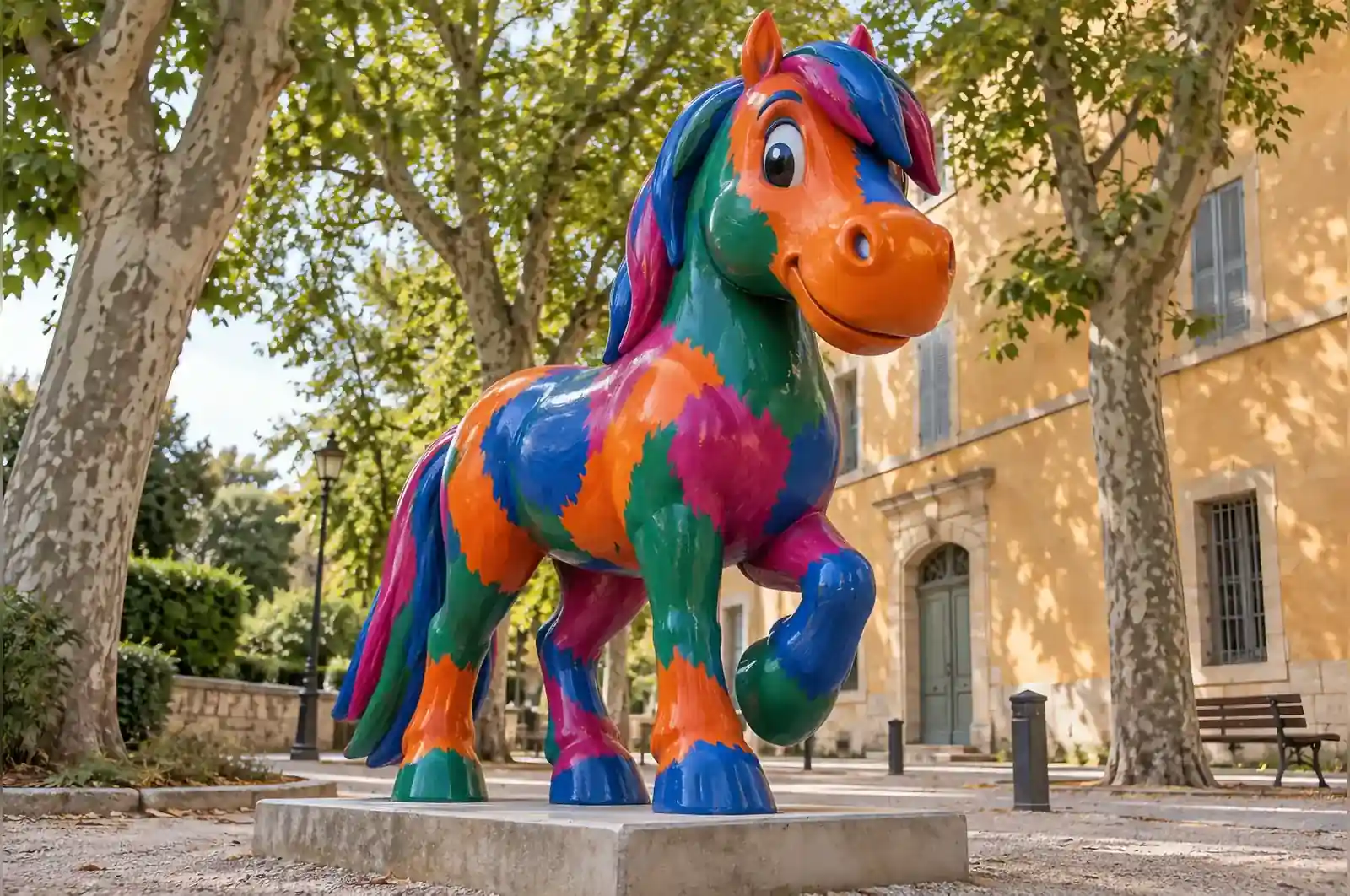
Arles is a town where nobody needs a lecture about colour. The brief was two lines long and the second line was the interesting one: no naturalistic colour anywhere.
The rule
The horse could be any colour except a horse colour. Not bay, not chestnut, not grey. Every surface had to be a colour that a horse has never been, and the transitions between those colours had to be visible brush strokes rather than sprayed edges.
Choosing the palette
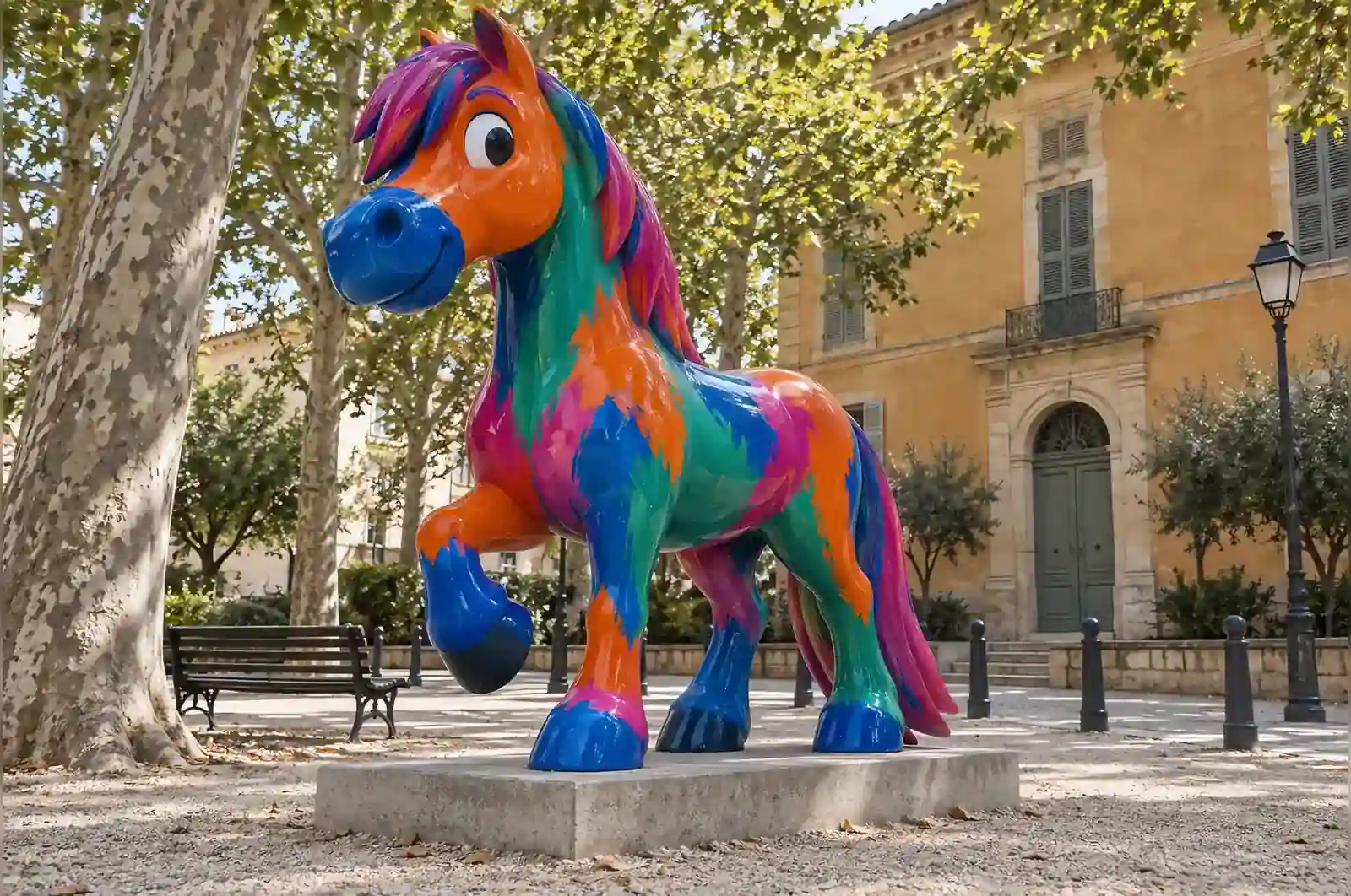
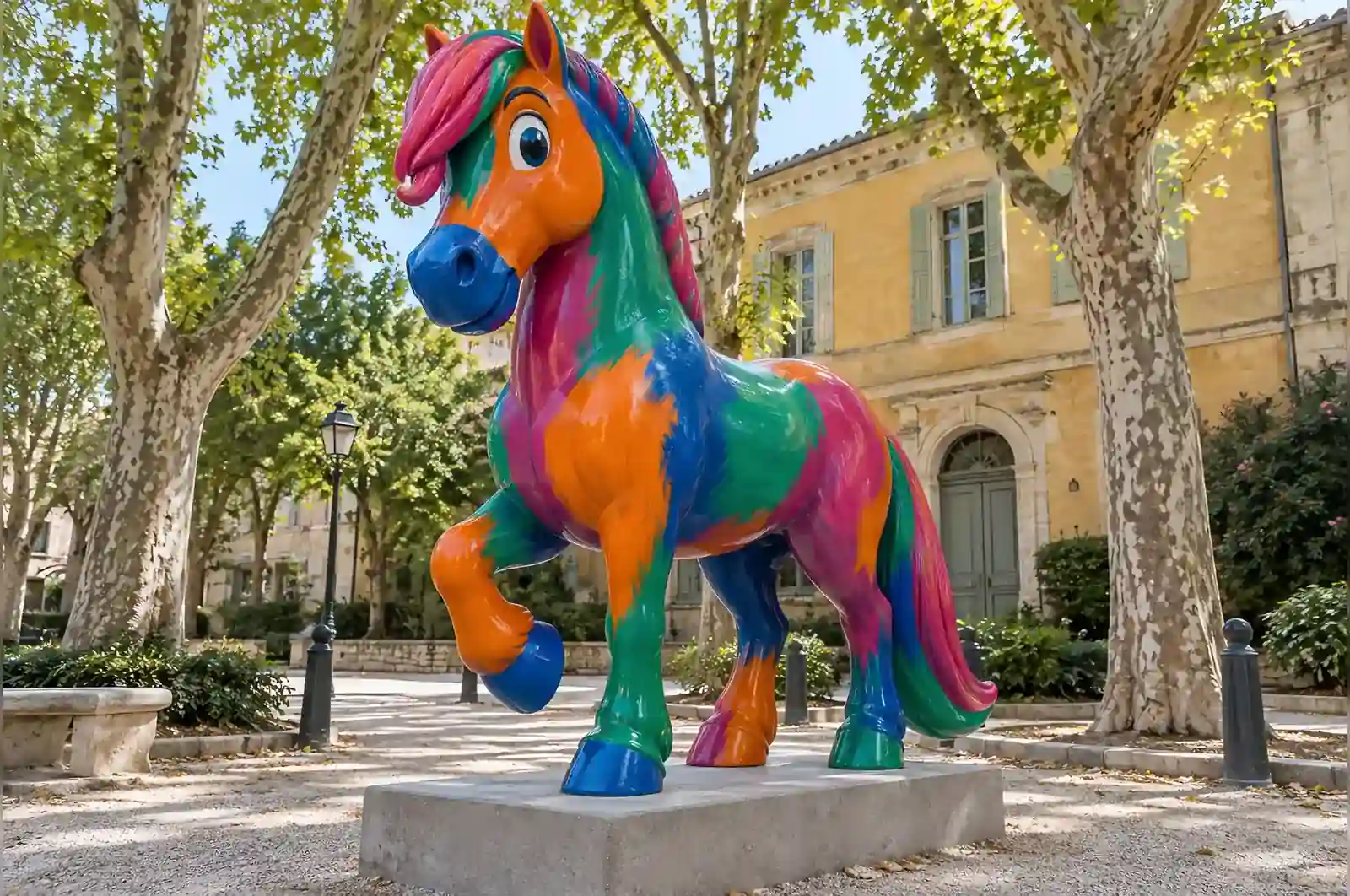
Four colours, chosen so that the piece changes character as the light moves: a hot orange over the head and shoulders, viridian along the flank and haunch, cobalt on the legs and the underside of the neck, and magenta on the mane, tail and the line of the spine.
The difficult one was cobalt. Blue legs on a horse read as cold and slightly unpleasant until the magenta mane sits directly above them, at which point the whole thing snaps into a painting. We got to that pairing on the fourth maquette.
Painting like a painter, not like a shop
Broad visible strokes with softened edges are not easy to produce with automotive equipment, which wants to lay down an even film. These were applied with large brushes in a slow-drying single-stage paint, worked wet into wet so the colours blend for a centimetre or so at each boundary, then sealed under a satin clear coat that keeps the brush texture legible without adding glare.
You can still read the direction of every stroke. It is the only piece we have made where the surface finish is the artwork and the sculpture is the support.
In the garden
It stands between two plane trees on the main cross path, where it is seen at an angle for most of the day and head-on only in the late afternoon. The municipal arts office reports a running argument in the local paper about whether the blue legs are a mistake. They are not.
What the site would not allow
The brief’s second line was the whole job, and the whole job was the constraint. If the colour rule had been negotiable, this commission would have resolved into a bay or chestnut horse with an even sprayed finish — a conventional garden ornament, and a far less memorable object. The piece is interesting because the rule was absolute and the palette had to follow from it.
The size, the palette and the brush scale were decided together, not one after another. At 2.2 m the strokes read as paint from the cross path about twenty metres away. If the piece had been dropped below roughly 1.6 m, the same brushwork would have collapsed into texture and the painting would have stopped being the subject. The recorded footprint — 2.2 m high by 1.0 m wide by 0.8 m deep — is also what the structure needs for this pose: the horse is hand-laminated over an internal steel frame, and that frame is sized for a slender standing figure rather than a broad four-square one.
The finish was the third linked decision. A gloss clear coat would have turned the flanks into a coloured mirror and hidden the strokes; a matt coat would have killed the wet-into-wet blending at the boundaries. Satin is the point that keeps both. If the piece had been sited indoors it would not have needed the UV-stabilised coat, but the colour logic and the stroke scale would not have changed at all.
How the finish holds up in an Arles garden
Arles is a hard environment for a painted surface: hot dry summers, strong UV, and the Mistral carrying dust. The paint is sealed under a satin UV-stabilised clear coat, and that coat is the surface that takes the weather. The strokes themselves sit inside the paint film, below the clear, so what wears is the clear layer and not the colour.
That layering is deliberate and it is the reason the piece needs so little care. The single-stage paint was worked wet into wet so the boundaries blend for a centimetre or so; once dry, that blend cannot be reworked in place. The clear coat is what protects it, and because it is satin rather than gloss, dust and rain marks do not streak the way they would on a car finish. The brush texture remains legible under the coat rather than being smoothed over by it.
The structure behind the paint is as straightforward as the brief. The internal steel frame carries the load and the hand-laminated FRP skin holds the shape, and the whole piece stands on a small foundation pad rather than being staked into the lawn. In a public garden the maintenance task reduces to the clear coat: washed down when it dulls and re-applied, which leaves the paint underneath untouched. The frame and the laminate need no attention at this size.
What this means for your own brief
Before asking for a quote on a piece like this, settle three questions.
First, is the palette fixed or open? On this commission the colour rule was absolute and the palette still took four maquettes to land, mostly on the cobalt and magenta pairing. If your brief says “surprising colours” rather than naming them, budget for the extra development rounds.
Second, where exactly will it stand? The clear coat specification, the stroke scale and the colour choices all change with sun hours and viewing distance. A piece designed for a shaded courtyard is not the same job as one on an open path, and it is worth saying so before the quote rather than after.
Third, is the surface the artwork or the support? Here the finish is the subject and the sculpture simply carries it. That is a different job from a piece where the paint is a protective skin, and it costs more in labour because it changes what the maintenance schedule has to protect.
People argue about the colour. A sculpture that people argue about in the street is doing something.
A municipal arts programme in Arles, France