
Linocut Cartoon Printmaker — Life-Size Sculpture, Arts Centre, Kraków
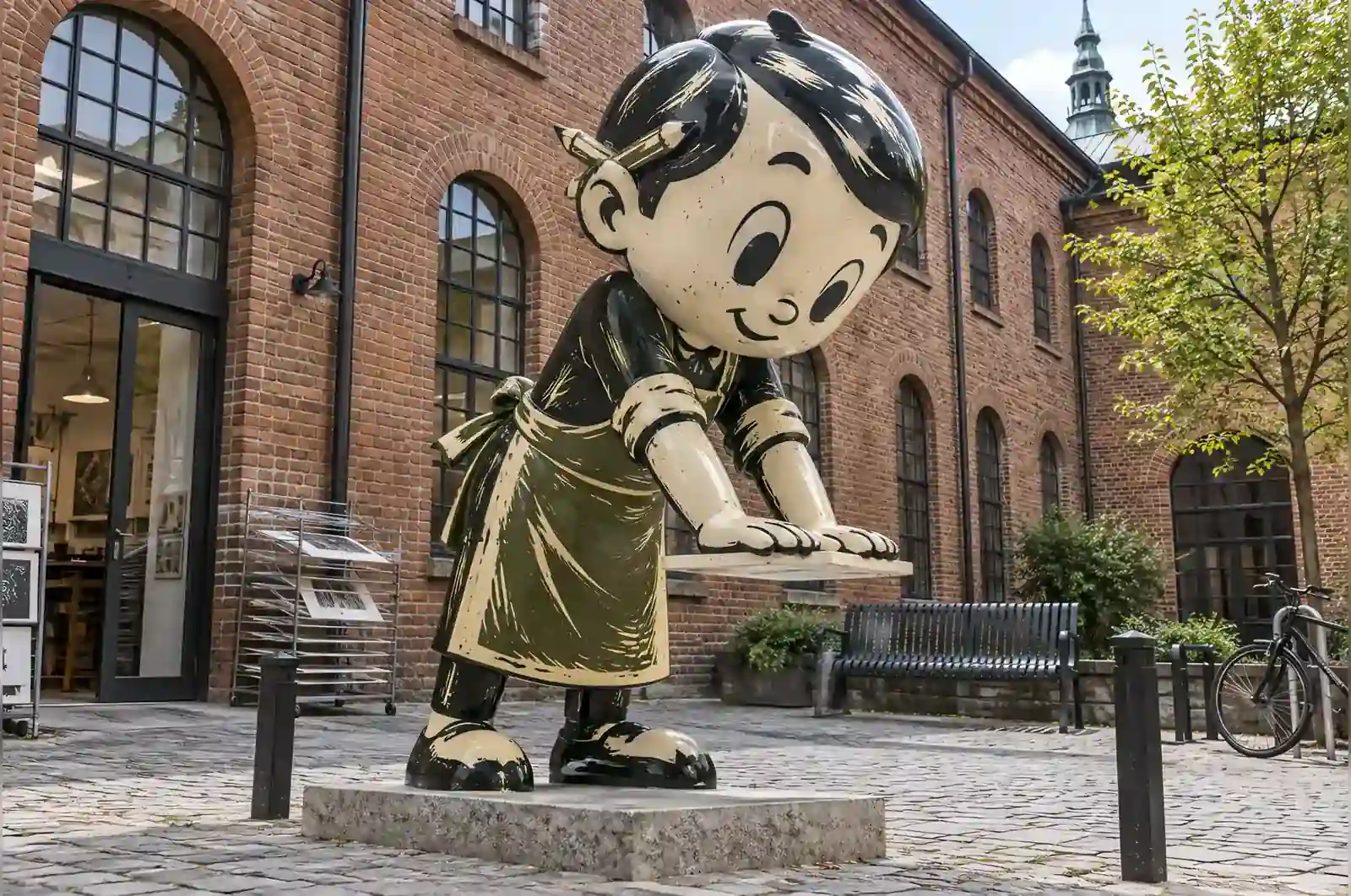
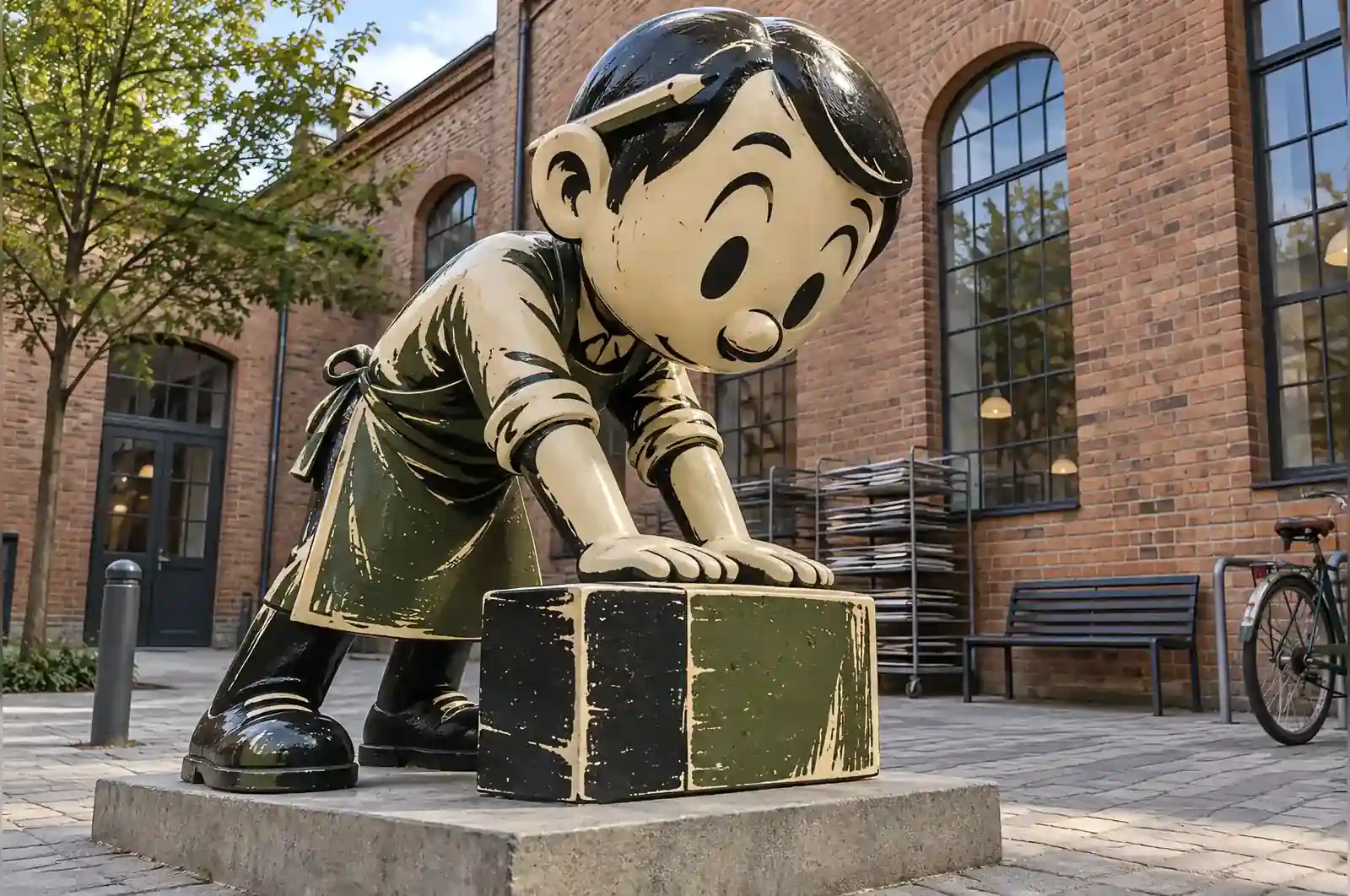
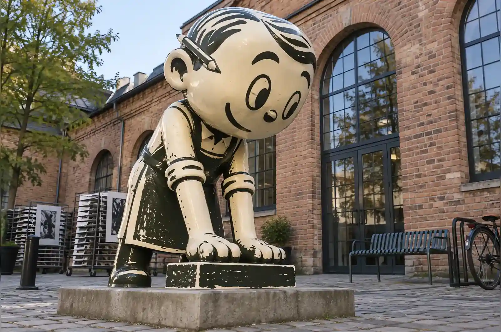
The centre teaches relief printing and has done since the 1960s. Their commission brief was, appropriately, written in the language of the process: they asked for a sculpture that could be read as a two-colour lino print.
Two inks, and a rule about everything else
A linocut made with two blocks has exactly two colours. Each block prints flat, so there are no gradients and no blending. Where the dark block is cut away, the lighter ink or the paper shows through, and where both blocks overlap there is one mixed tone.
The sculpture follows all of that. A warm cream ground, a deep olive middle tone, and a near-black for the lines and the deepest shadow. Three tones in total and not one of them blended into another.
Copying a cut, not a drawing
The character of a linocut is in the tool marks: short strokes of a gouge, a slightly ragged edge wherever a line ends, and occasional small areas where the ink did not take because the surface was cut too deep.
We cut the maquette’s surface with actual gouges at 260 mm before casting it, so the enlarged piece carries real tool marks. There are roughly two hundred places on the finished sculpture where a shape has been reduced to a stroked hatch instead of a solid, exactly as a printmaker would solve a mid-tone.
The registration is deliberate and slightly off. In a two-block print, the two impressions almost never line up perfectly, and the resulting sliver of cream along one edge of every dark shape is the single most recognisable thing about the medium. Ours is offset by about 5 mm, consistently, in one direction, as though the paper had shifted on the press.
In the courtyard
It stands at 2.1 m beside the drying racks, where students wait for proofs. The centre runs an exercise where a class has to identify which parts of the sculpture could not have been made with two blocks, and the answer, correctly argued, is that none of them could.
What was fixed by the brief
The brief settled the two things that could not be given up. First, the reading had to survive: this had to be a two-colour linocut, not a painted figure with two colours on it. That is why the tones stay flat, the tool marks are real rather than suggested, and the registration is left off by 5 mm instead of being corrected. Remove any one of those and the object stops being a print.
Second, the scale. At 2.1 m the piece is seen at arm’s length and across the courtyard, and the carved detail has to read at both distances. The gouge marks were cut at 260 mm precisely because a 1:8 enlargement keeps the strokes legible. If the size had been dropped to, say, 900 mm, the same marks would have become fine texture and the exercise the centre runs would have nothing to find.
The finish was likewise not negotiable. The cream ground, the olive mid-tone and the near-black lines are the three tones the two blocks actually produce. A single-colour figure would have been simpler to build, but it would not have answered the brief, and it would have changed nothing about the cost.
Built for a Kraków courtyard
The sculpture is hand-laminated fibreglass over an internal steel frame, and that construction is what lets it live outside in Kraków. The shell is solid but the inside is not sealed; water that gets in has to get out, and the laminate is laid with a low weep point at the base so standing water cannot collect and freeze across the winters. Kraków freezes hard enough that a sealed hollow would risk splitting, and the weep point is the single piece of detailing that protects it.
The gloss paint does the weather work. The ground is a pale cream, which is the tone that shows every mark first, and the gloss is what makes the difference between a wipe-down and a repaint. Rain runs off the irregular carved edges rather than soaking into them, and the near-black lines are sealed under the same coat, so the two inks weather at the same rate and the registration stays readable as the surface ages.
Maintenance is a cloth and a bucket. The steel frame is galvanised and the laminate is UV-stable, so there is nothing to repaint on a cycle and no coating to renew. The one thing we check on a visit is the weep point, which is the only part of the build that can block, and it takes minutes to clear.
What this means for your own brief
Before you ask for a quote on something similar, settle three things. First, what the reading has to be. If your piece needs to read as a specific medium — a print, a drawing, a carved block — that decision comes before the size and the colour, because it dictates how the surface is worked and how long the build takes. Second, where it will stand and what the climate does. An exposed site in a city with real winters asks for different detailing than a sheltered interior, and telling us the location up front means the weep point, the gloss and the laminate are chosen for it rather than assumed.
Third, the scale, because the scale decides how much of the detail survives. Tool marks and registration offsets are only legible when the piece is large enough to carry them, and a detail cut at 260 mm reads very differently at 2.1 m than it does at 900 mm. If the detail matters, decide the viewing distance first. On this commission all three were answered before the 12-week build started, which is why nothing had to be reworked halfway through.
It reads as a print from across the courtyard and as a sculpture up close. Our students spend a whole afternoon on the second half of that sentence.
A printmaking centre in Kraków, Poland