
Vapourwave Cartoon Skater — Life-Size Sculpture, Skate Park, Barcelona
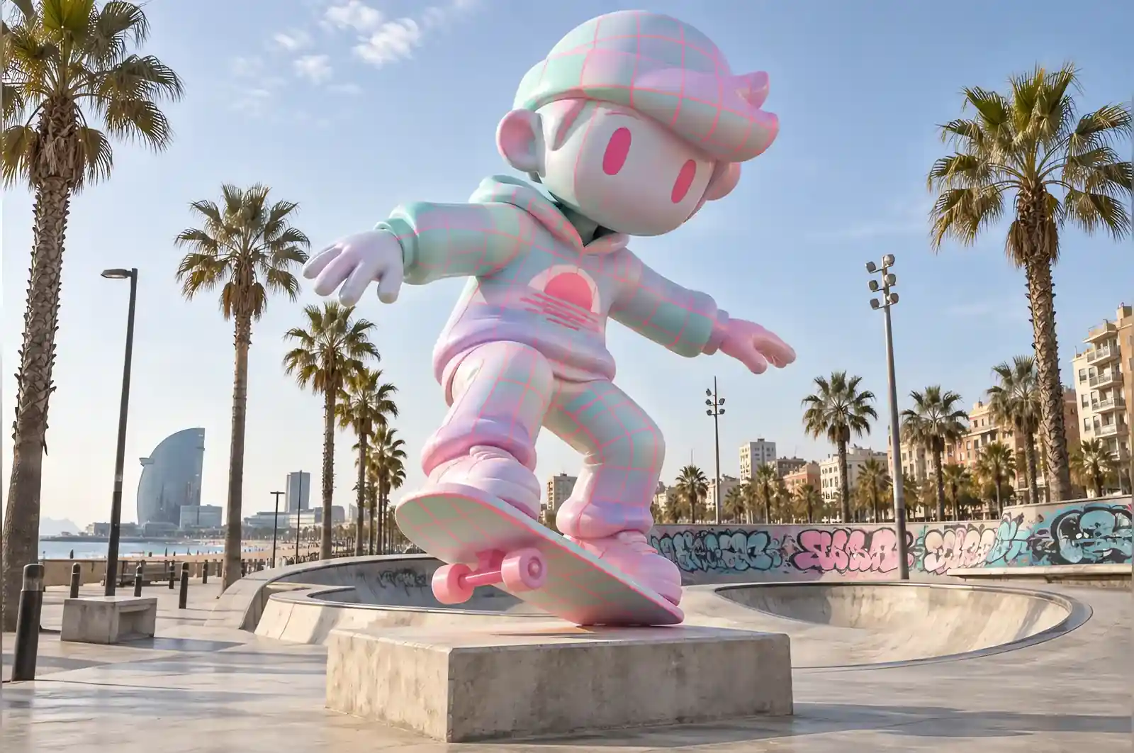
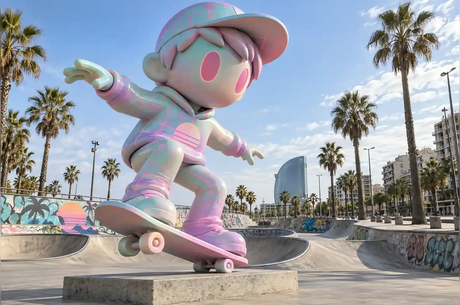
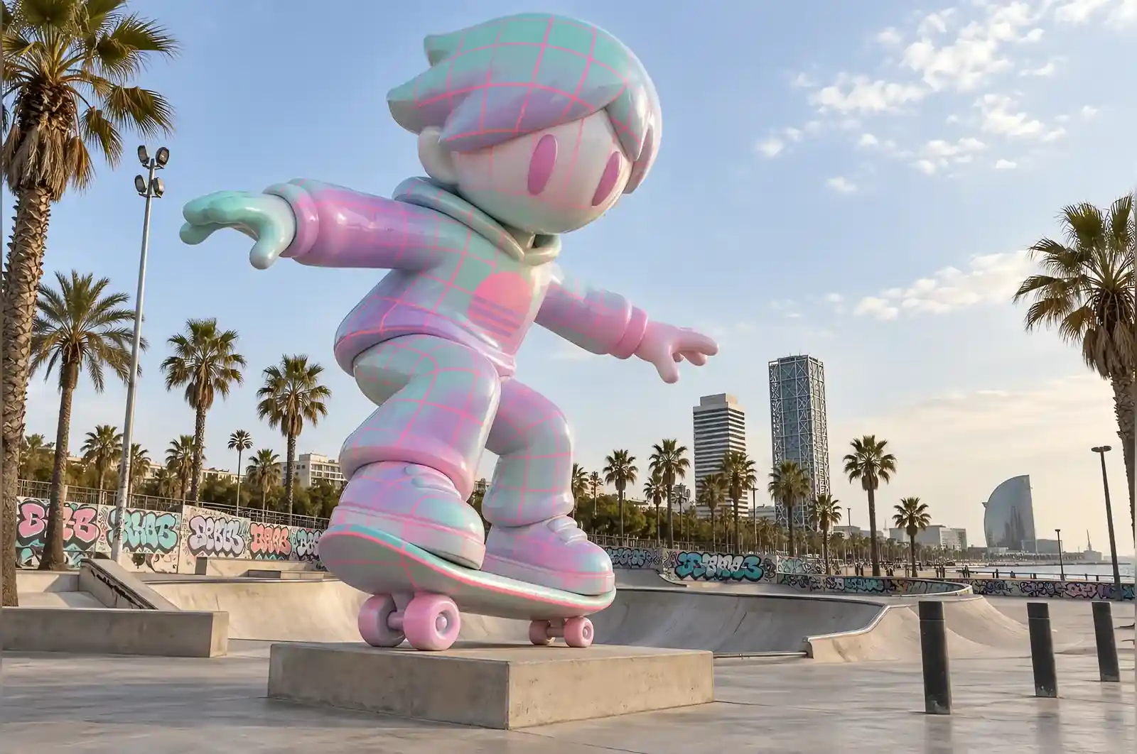
The youth programme’s brief was four words long and was delivered verbally: make it look like the internet in 1994. We asked for clarification twice and got the same answer, so we built it.
Translating a joke into a surface
There is a specific aesthetic that people of a certain age recognise instantly: pastel gradients, neon wireframe grids, a low half-sun cut off by a horizon line, and a general feeling of smooth early computer graphics. Vapourwave. It is a screensaver, a shopping bag and a record sleeve at once.
All of it on a 2.3 m fibreglass skater. The gradient is the ground, running from mint at the feet through lilac at the waist to pale pink at the head. The grid is a fine neon pink wireframe drawn over the entire figure, curving with the form exactly as a 3D wireframe would. The sun is a low half-disc, airbrushed across the back of the hoodie.
Keeping a high-school joke from becoming unreadable
Two rules. First, the grid conforms to the geometry of the body, so the figure is still legible as a figure. Second, nothing crosses the face — the head keeps the pastel gradient and nothing else, which is where the cartoon survives.
The board itself is the one piece exempt from the scheme. It is plain, matte and dark, because the kids at the park told us during consultation that a decorated board would look wrong, and they were correct.
Airbrushing a gradient nobody can see the joins in
Three colour transitions across 2.3 m, laid wet and blended with a wide soft airbrush, then sealed satin. Gloss was tried on a test panel and rejected: the reflection line ran straight down the middle of the figure and cut the gradient in half.
At the skate park
It stands at 2.3 m on the apron between two bowls, well clear of the riding lines. The programme says the teenagers who were consulted about it now defend it against criticism, which is more engagement than the park’s previous public art ever generated.
What was non-negotiable, and what would have changed
Three decisions were fixed before the first layer went on, and each would have broken the piece if it had gone the other way.
Size was the anchor. At 2.3 m the gradient has room to run mint-to-pink across a full figure and the grid has enough cells to wrap the torso without turning into a texture. A metre shorter and the transitions would have compressed into bands and the figure would have read as a painted statue instead of a screen. The 2.3 m was not a style choice — it was the smallest height at which the whole scheme could breathe.
The satin seal was not negotiable either. Gloss was tried on a test panel and it put a straight reflection line down the figure, splitting the gradient. The finish is what carries the joke, so the finish was allowed to dictate the sealer.
Placement came last. It stands outdoors between two bowls, clear of the riding lines. Indoors, under flat lighting, the wireframe grid would have read as a flat print and the half-sun would have lost its cut. The skate park is the one setting where the reference and the reality meet — the brief was about a place, not just a figure.
How it is put together, and what it needs
The structure is hand-laminated fibreglass over an internal steel frame. At 2.3 m tall and only 0.7 m deep the figure is a tall, narrow object, and the frame carries most of the load. It runs from the contact patch of the board up through the standing leg into the shoulders, so the cantilever of the pose is held by steel rather than by the skin. The fibreglass supplies the surface and the colour; the steel supplies the stiffness.
The board is the most exposed part. It is matte and dark, it sits at foot height, and it takes the kicks, scuffs and dust a skate park generates. It was deliberately excluded from the scheme for that reason — a plain board can be touched up cheaply, while a decorated one would need the whole motif repainted after a scuff.
For aftercare, the satin seal matters more than it looks. A local repair on a satin surface blends back into the surrounding gradient without re-doing the whole panel, which is another reason the rejection of gloss simplified maintenance. In a Mediterranean climate the figure sees strong UV and warm nights; the sealed surface is washed down with water and a soft cloth, and the dark board is checked for chips after busy events.
What this means for your own brief
If you are commissioning something similar, three questions settle most of the design before a quote is ever asked for.
First, what is the hero angle? The scheme here is built to be walked around — the grid wraps the form and the sun sits across the back of the hoodie. If a figure will be seen mainly from one side, the layout can be composed for that view; if it will be circled, the pattern has to survive every rotation. Decide this before the 3D is approved, not after.
Second, what does the venue do to the finish? Outdoor light and indoor light read a gradient and a wireframe very differently, and a sealer that works in one will fight the other. The gloss test panel here was not wasted — it settled the sealer in an afternoon.
Third, how much of the figure has to stay clean? The face and the board were both deliberately left out of the decoration, and that is what keeps the piece readable after years in use. If a brief needs a decorated face or a decorated contact surface, the buyer should know that the maintenance load goes up with it.
Answer those three and a quote becomes a formality; skip them and the design will fight the site.
It looks like a screensaver from 1994 and it is a sculpture of a teenager. The kids here worked out what it was before we did.
A city youth programme in Barcelona, Spain