Chorus — Five Cartoon Abstract Characters, Rotterdam
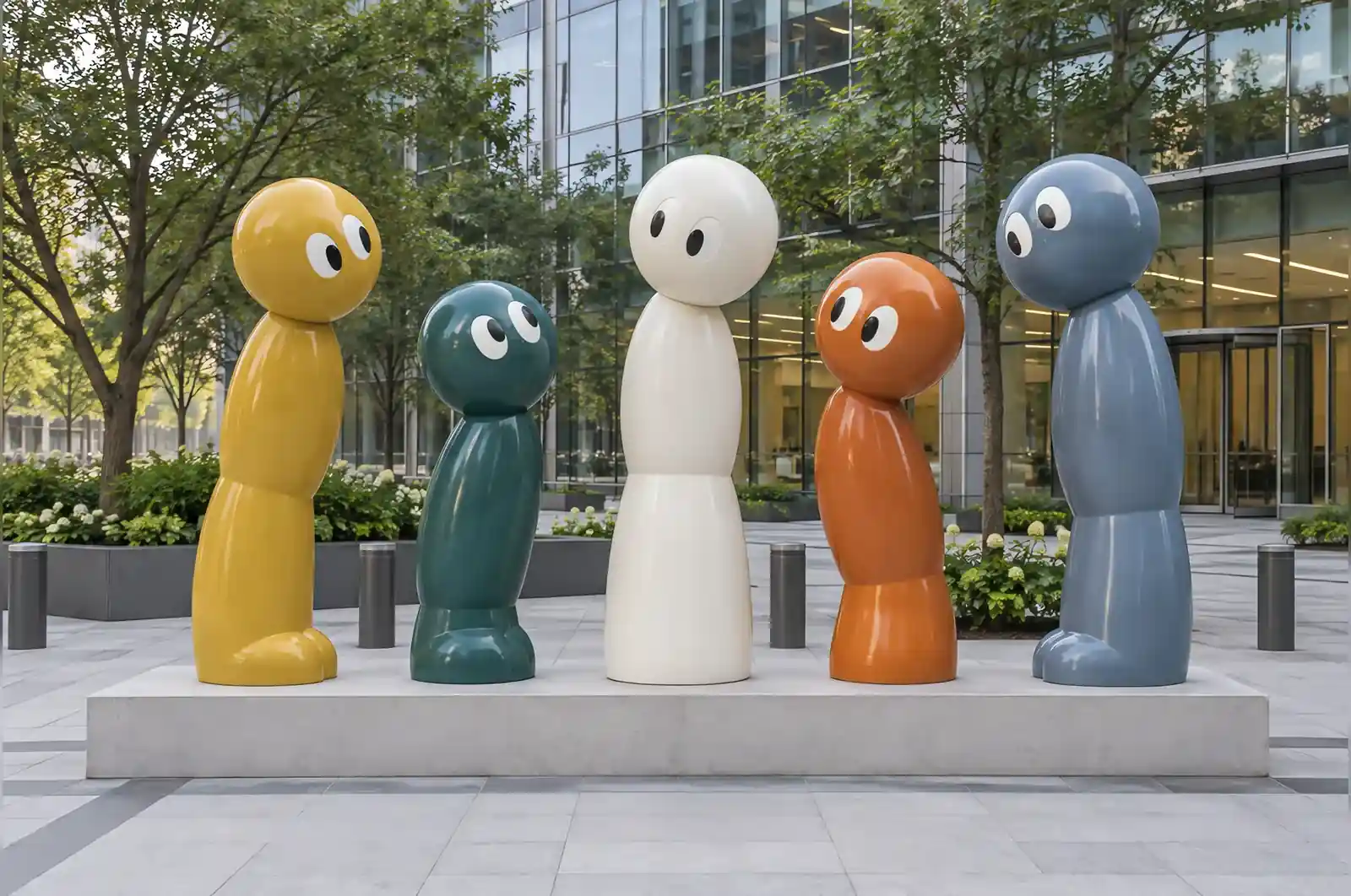
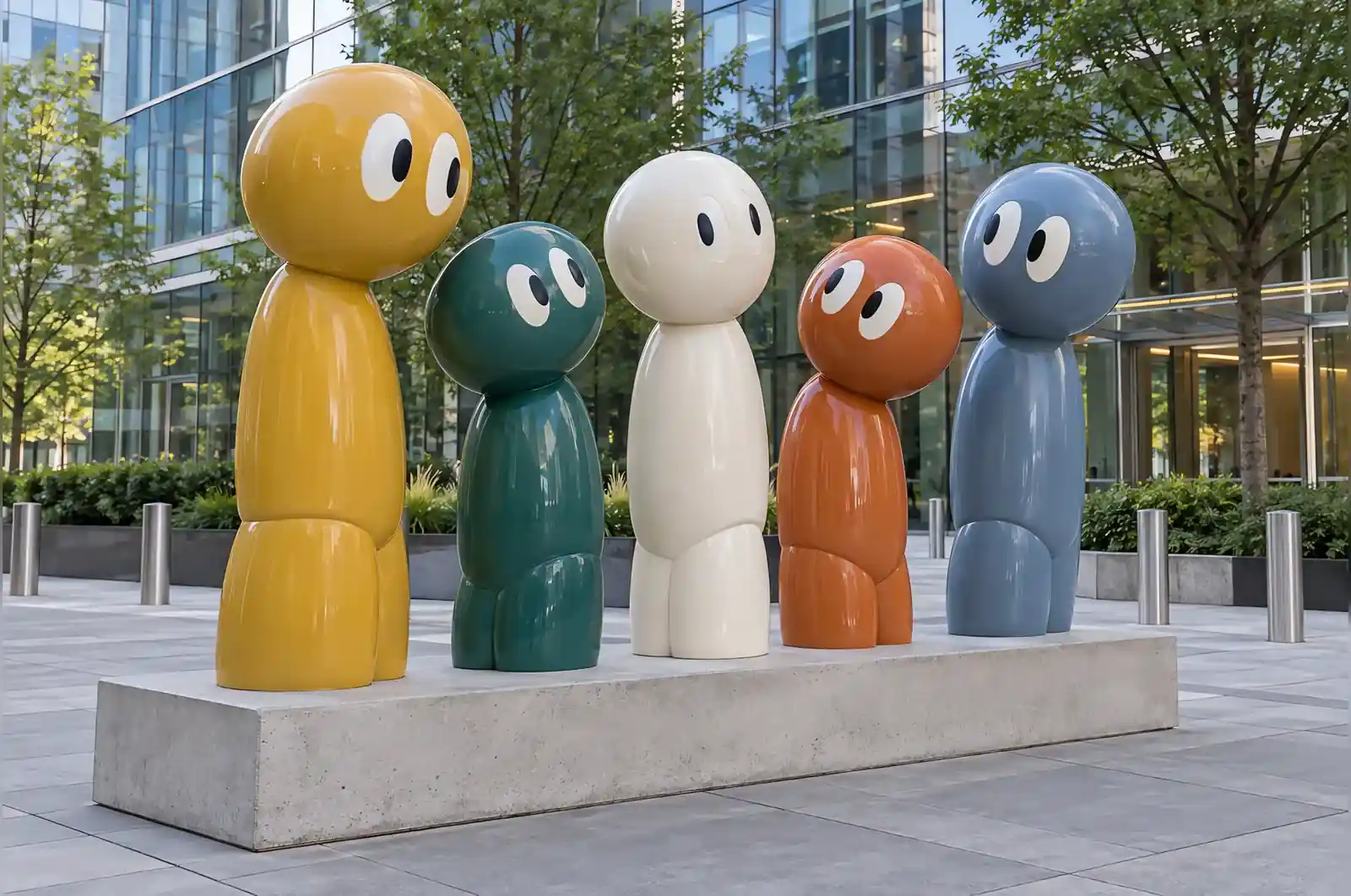
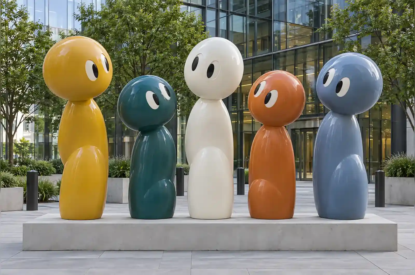
A developer in Rotterdam needed something for the forecourt of a new office building that would not read as a corporate logo and would not date. What they asked for, in the end, was a group of cartoon characters with no faces.
The brief
Five characters, no two the same height. No likenesses, no text, no uniforms. The design brief mentioned two viewing distances explicitly, and that is what made the piece interesting: from the eighth floor the group had to read as characters in conversation, and from the pavement it had to read as five separate blocks of colour.
Making a group out of five silhouettes
The answer was to keep each character extremely simple — oversized rounded head, two eyes, a body reduced to one rounded column — and to put all the variation into height, colour and lean angle. Each one tilts or leans slightly differently, so the group reads as a conversation rather than a row. Getting those lean angles right took longer than the figures themselves: too uniform and the group looked regimented, too varied and it stopped reading as a group at all.
What the plaza would not trade away
The requirement that could not move was the double read. From the eighth floor the five had to look like people talking; from the pavement they had to look like five flat blocks of colour. That is not a styling preference, it is a function of the site: the building is tall enough that a tenant looks down on that forecourt for years, and the plaza is public enough that the same work is seen from ground level every day of the week.
If that had not been fixed — if the piece had gone into a single-storey courtyard instead, where it is only ever seen from one level — the whole approach would simplify. The lean angles and the spacing that make the group read as a conversation exist only for the high view; at one level you would keep the five silhouettes and let the colour carry the piece. Likewise the palette was specified against the building’s grey cladding rather than against the other four colours, so a different facade would have meant re-specifying all five fields from scratch, not tuning one.
The finish
Five flat colour fields — ochre, deep teal, off-white, burnt orange and slate blue — in automotive paint under a UV clear coat. The colours were specified to sit against the building’s grey cladding rather than against each other, which is the decision that stops the piece looking like a colour chart.
Gloss paint in a maritime climate
Rotterdam is a working port, and the air off the North Sea carries salt and rain for much of the year, so the coating is the part of this commission that has to work hardest. The five colour fields are automotive paint, which is not especially UV-stable on its own; the UV clear coat over the top is what keeps the ochre and the burnt orange from fading over the first few years. On a gloss piece like this the clear coat is effectively the maintenance surface.
Rain is the practical concern here rather than sun. On a gloss finish the marks you notice are not damage but drying — water beads and leaves streaks, and on a group of five rounded forms the tops of the heads are the flat spots where dust and rain settle. The spec for this site is a soft wash and a wipe-down a couple of times a year, which is a ladder and a chamois rather than a maintenance crew. The engineered steel frame inside is fully enclosed by the fibreglass shell, so there is nothing exposed to corrode at the joints, and because the whole group sits on one plinth there are no separate footings to settle out of line over the seasons.
Installation
One continuous 6 m plinth poured in situ, with all five characters set in on the same day. Total install was two days. Because they are fibreglass over steel they could be lifted by hand off a small crane, so no road closure — on a city-centre site that is the difference between a one-week job and a two-month one.
What it cost
Five characters on a shared plinth sits at the top of the fibreglass band for this scale, $5,000–$15,000. This commission came in at $24,600 delivered and installed, sixteen weeks from 3D approval.
The three decisions to settle before you ask
On a commission like this a couple of questions decide most of the look and most of the number, and they are worth settling before you ask for a quote.
How many viewing distances does the piece need to work at? This group had to read from an upper floor and from the pavement, and that effectively doubled the design work on the lean angles and the spacing. If yours has a single viewing position, say so — it is the difference between a group that reads as a conversation and a row of separate objects.
Faces or no faces? The no-likeness, no-text, no-uniform instruction is what stops this reading as a corporate logo. If you actually need a character with a face, that is a different brief, a different mould and a different price.
What is the backdrop? The five colours were chosen against the building’s grey cladding, not against each other. If you know the wall colour before you commission, the palette can be specified properly the first time instead of being adjusted after.
From the eighth floor it reads as a group of characters standing together. From the pavement it reads as five colours. We asked for both and got both.
A property developer in Rotterdam