Signal — Vapourwave Cartoon Abstract Character, Media Plaza, Amsterdam
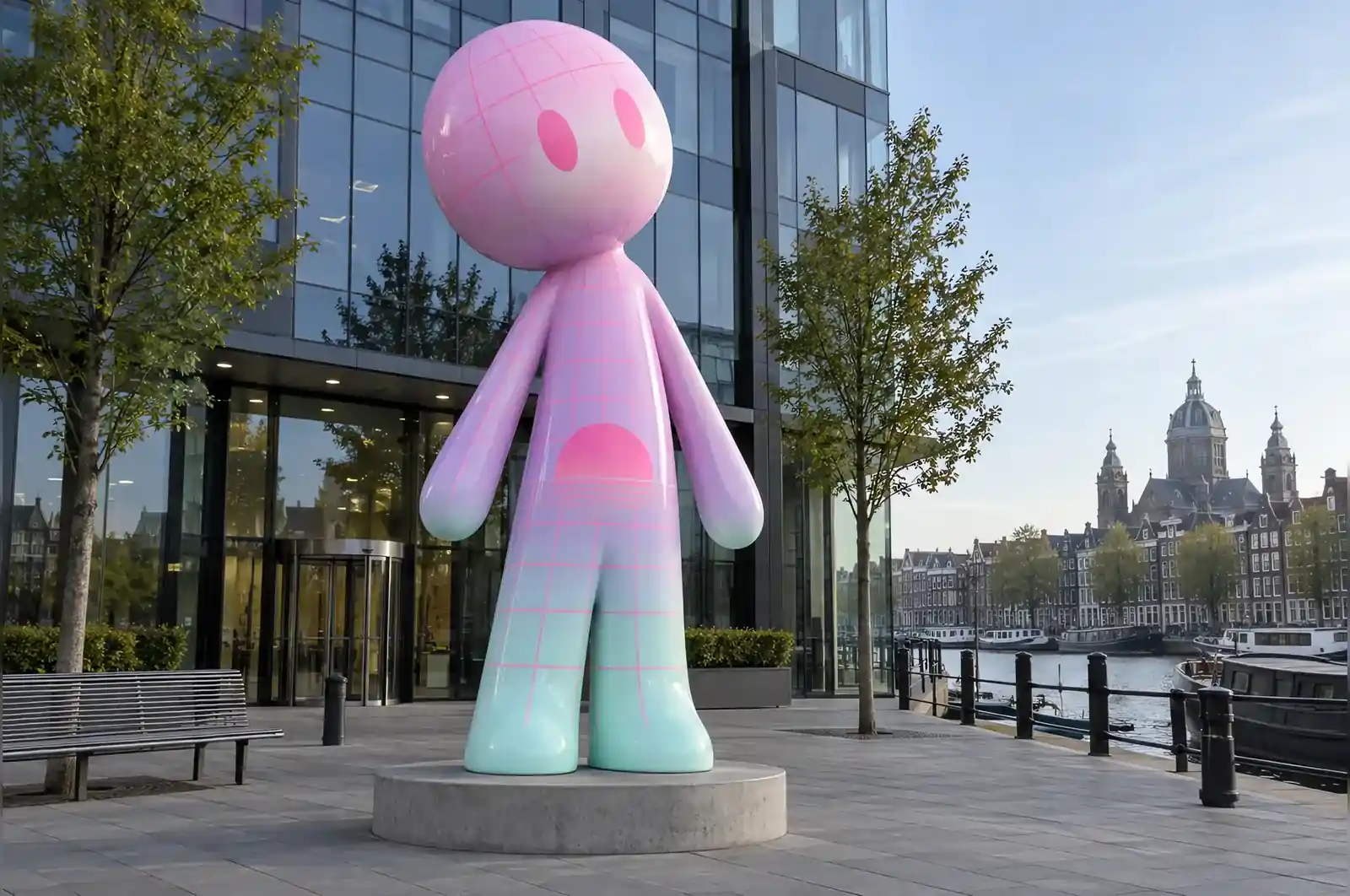
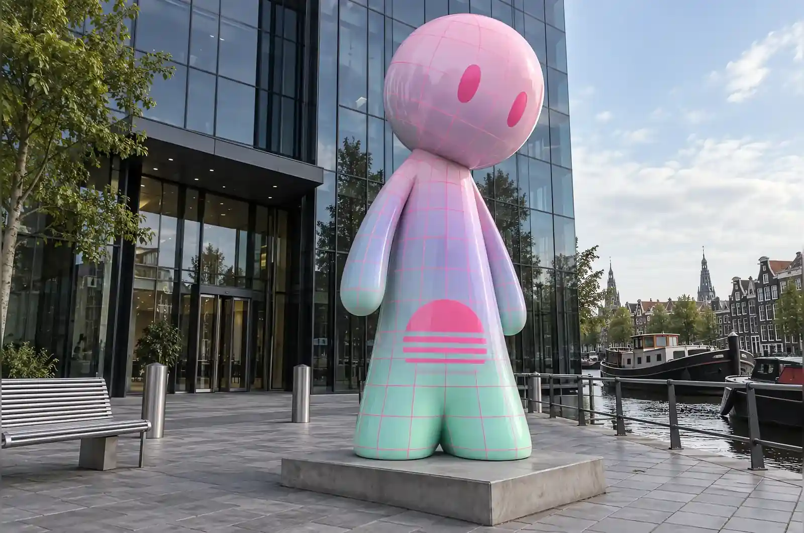
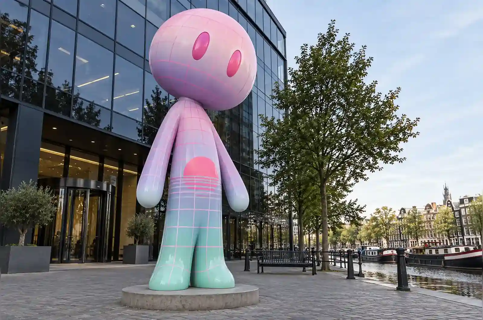
The company makes software that most people encounter as an interface. They wanted a sculpture about that, which is a difficult thing to commission, and they were clear that they did not want anything resembling a screen.
The brief
A character, about 3 m, no identity, no screen, and a surface that would say something about the era in which their industry grew up. Their suggestion, delivered with some embarrassment: vapourwave.
Taking a joke seriously
Vapourwave is a specific and quite precise aesthetic: pastel gradients, a neon wireframe grid, a low half-sun disc cut by a horizon, and a pervasive sense of smooth, faintly melancholy early computer graphics. It is also, mostly, a joke.
It stops being a joke here for one reason: the grid is mapped properly. The wireframe wraps the body the way a real 3D wireframe would, which means the lines converge at the shoulders and the crown of the head, and it means the character’s form is described by the grid rather than hidden by it. A pattern stuck on a sculpture would have been a joke; a pattern that behaves like the geometry it is drawn on is a piece of work.
Gradient and grid
The gradient runs from mint at the feet through lilac at the waist to pale pink at the head, laid wet and blended with a wide airbrush across nine bands. The grid is drawn over it in a neon pink, and the sun is a low half-disc spanning the lower back and one hip.
The face is the one area held back: the two simple eyes and the plane of the head carry only the pastel gradient. No grid, no sun, nothing. It is where the character reads, and putting decoration there would have cost us the piece.
On the plaza
It stands at 3.0 m on a low dark plinth, angled towards the canal so that it is seen first from the water side. The company’s own lighting designer specified uplighting and has since offered us photographs of it at four in the afternoon in February, which is when the gradient does the most work.
The three fixed points
Three things were non-negotiable on this commission, and each one changes the piece if it is removed. The size: at 3.0 m on an open plaza the character has to hold its own against the building behind it and the canal in front, and it needs the full vertical run for the wireframe to converge at the shoulders and the crown of the head. Drop it below about 2 m and the grid, which is the entire argument of the piece, loses the geometry it is drawn on and the figure reads as a decoration rather than a landmark.
The finish was the second fixed point. The client wanted a surface that said something about the era in which their industry grew up, and that is the vapourwave. Change it to a solid metallic or a plain matte and the brief is no longer the same piece: the gradient, the grid and the half-sun are what carry the meaning, not the form.
The third was placement. Angled towards the canal with uplighting specified by the client’s own lighting designer, the piece is read first from the water side. Moved indoors it would lose that; under a fixed ceiling source the gradient would not do the work it does at four o’clock in February.
Rain and the airbrushed surface
Amsterdam is a maritime climate and this piece stands outdoors beside a canal, so the gloss is not decorative. The FRP is hand-laminated over an internal steel frame: the steel carries the structural load and stops the shell from flexing across the 3.0 m height, while the fibreglass skin gives the smooth surface the finish is applied to. The gradient is laid across nine bands, blended wet with a wide airbrush, and the neon grid is drawn over it, so the grid is the outermost painted layer rather than a film over the gloss.
That ordering decides the aftercare. The gloss-painted surface sheds rain, and it is the reason the pastel reads cleanly from the water side; but because the grid is on top, the surface has to be cleaned without abrasives. A soft cloth and a mild detergent, a rinse rather than a scrub, keeps the lines intact. The low dark plinth shows marks more readily than the figure, and the uplighting lens needs an occasional wipe, since it is what does the work at four in the afternoon. An annual check of the gloss and the fixture is the whole maintenance schedule for a piece of this size.
Before you ask for a quote
If you are commissioning something like this, three questions are worth settling first. The first is whether the finish is part of the brief or the form is enough. When the surface has to carry meaning, the pattern has to be mapped to the geometry it is drawn on, not applied to it; that mapping is where the work is, and it is worth asking how it is done before you compare prices.
The second is where it will stand and when it is seen. This piece is sized and angled for an open plaza read from the water side, in daylight that peaks in the afternoon. A smaller piece, or one read from a street or a doorway, needs different proportions and a different light.
The third is whether the site is exposed. An outdoor position in a maritime climate changes the maintenance regime, and it decides whether the surface you choose is practical. Settle the base and the orientation as well: here the low dark plinth and the angle to the canal were part of the design, not an afterthought.
It is three metres of a screensaver standing in a plaza. Our visitors photograph it before they photograph the building, which we have decided not to take personally.
A media company in Amsterdam, Netherlands